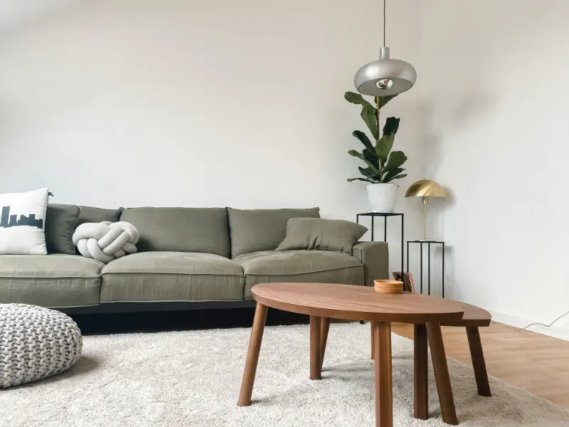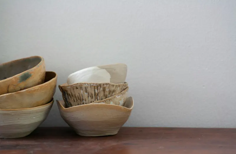
Texture is the quiet force in a room, the thing you feel before you notice it. It’s the raised grain of a wooden table, the nubby loop of a wool rug, the cool slickness of a leather armchair. When it’s working, you barely register it. When it’s not, a room feels oddly chaotic, as if you can’t relax but can’t quite explain why.
The trouble is that most of us think in terms of color and furniture size, not in terms of rough and smooth, matte and shiny, dense and airy. So textures pile up without intention. Throws become clutter, pillows feel fussy, rugs fight with each other. The room isn’t exactly dirty, but it reads as “messy.”
The good news: the line between layered and chaotic is surprisingly thin. Once you learn to see texture as clearly as you see color, you can edit and adjust a space in an afternoon.
The first culprit is too many competing small textures. Think of three different knits on throws, five pillow fabrics, a patterned rug with a high-low pile and an open-weave basket, all in one compact living room. Each piece is attractive alone, but together they create visual static. Your eye doesn’t know where to rest, so the entire scene feels unsettled. The brain often reads that unsettled feeling as “mess.”
Editing begins with asking what role each texture is playing. Does this chunky knit throw earn its place by adding warmth where everything else is smooth and cool? Does that third patterned cushion say something new, or does it simply speak louder in the same register? Rooms that feel calm often rely on fewer types of texture, repeated with intention. Two or three key materials, revisited across the space, are usually enough for a home setting.
Another subtle misstep is unbalanced contrast. Picture a room of only hard, sleek surfaces: glass coffee table, metal legs, flat-weave rug, tight-back sofa in a crisp fabric. The textures are consistent, but the effect is sharp, almost brittle. One stack of wrinkled magazines or a single rumpled blanket, and suddenly the corner feels sloppy instead of inviting, because there was no soft context prepared for that inevitable everyday disorder.
On the flip side, a room where everything is soft and fuzzy—plush carpet, velvet sofa, boucle chair, fringed cushions—can feel upholstered in sound. Without a few harder, reflective textures to catch the light and define edges, forms visually melt into one another. Messy piles appear faster in spaces where the boundaries between objects are blurred. You are not just decorating; you are drawing outlines with materials. Harder, smoother pieces act as commas in a sentence of softness, giving the eye a chance to pause and make sense of what it sees.
There is also the issue of scale. Tiny, busy textures—micro-knits, petite basket weaves, tight herringbones—read almost like patterns. Too many of them in close quarters can mimic the effect of cluttered tabletops. In a small apartment, one oversized, tactile element, like a thick wool rug or a substantial linen headboard, often looks cleaner than a scattering of little textural whispers.
When there are too many reflective textures, clutter multiplies in the mirror world. The same items appear again and again from different angles, creating a sense of disorder even when the actual surfaces are relatively clear. If your space feels busier than it should, try dimming the sheen. A matte vase instead of a glass one, a honed finish instead of polished, a lampshade in linen instead of shiny fabric—each of these choices softens the light and reduces visual echo.
There is a parallel problem with deep, light-absorbing textures. Heavy drapes, thick-pile rugs and dark, textural upholstery can drink in light, especially in small rooms. Corners sink into shadow, making objects there blend together. A stack of books on a dark, nubby ottoman appears as a single indistinct mound. To the eye, that mound reads as “something left out,” another note of mess. Introducing a smoother, lighter object in that same zone—a pale tray on the ottoman, a ceramic side table by the drapes—creates a contrast that separates items again, restoring legibility.
Perhaps the most human texture mistake is forgetting that homes are lived in, not styled once and frozen. A sofa might look sculptural with perfectly karate-chopped pillows in a photograph, but it has to tolerate rumpled clothes, laptop cords and the stray tote bag. If your permanent textures are already chaotic, every new object added by daily life pushes the room further toward disarray.
The gentler approach is to design with future mess in mind. Choose foundational textures that are forgiving: a sofa fabric with subtle weave, a rug with a bit of variation in tone, a dining table that doesn’t glare at every crumb. Aim for a balance where a forgotten sweater draped over a chair feels like part of the softness of the room, not an interruption of order. When the bones of the space have calm, readable texture, everyday objects sit “on” the room instead of fighting against it.
In the end, texture is a language you already speak without noticing. The task is to listen more closely. Look around your room and mute one texture that is shouting. Repeat another that feels quietly right. Swap a single shiny surface for something matte. As you do, the room often shifts, almost imperceptibly, from messy to composed—a place where your eye can rest, and you can, too.
The trouble is that most of us think in terms of color and furniture size, not in terms of rough and smooth, matte and shiny, dense and airy. So textures pile up without intention. Throws become clutter, pillows feel fussy, rugs fight with each other. The room isn’t exactly dirty, but it reads as “messy.”
The good news: the line between layered and chaotic is surprisingly thin. Once you learn to see texture as clearly as you see color, you can edit and adjust a space in an afternoon.
When Variety Becomes Visual Noise
A common mistake is mistaking “more” texture for “better” texture. Online and in magazines, you see rooms rich with boucle sofas, shag rugs, ribbed ceramics and slubby linens. What you don’t see is the quiet discipline behind those choices: repetition, contrast and restraint.The first culprit is too many competing small textures. Think of three different knits on throws, five pillow fabrics, a patterned rug with a high-low pile and an open-weave basket, all in one compact living room. Each piece is attractive alone, but together they create visual static. Your eye doesn’t know where to rest, so the entire scene feels unsettled. The brain often reads that unsettled feeling as “mess.”
Editing begins with asking what role each texture is playing. Does this chunky knit throw earn its place by adding warmth where everything else is smooth and cool? Does that third patterned cushion say something new, or does it simply speak louder in the same register? Rooms that feel calm often rely on fewer types of texture, repeated with intention. Two or three key materials, revisited across the space, are usually enough for a home setting.
Another subtle misstep is unbalanced contrast. Picture a room of only hard, sleek surfaces: glass coffee table, metal legs, flat-weave rug, tight-back sofa in a crisp fabric. The textures are consistent, but the effect is sharp, almost brittle. One stack of wrinkled magazines or a single rumpled blanket, and suddenly the corner feels sloppy instead of inviting, because there was no soft context prepared for that inevitable everyday disorder.
On the flip side, a room where everything is soft and fuzzy—plush carpet, velvet sofa, boucle chair, fringed cushions—can feel upholstered in sound. Without a few harder, reflective textures to catch the light and define edges, forms visually melt into one another. Messy piles appear faster in spaces where the boundaries between objects are blurred. You are not just decorating; you are drawing outlines with materials. Harder, smoother pieces act as commas in a sentence of softness, giving the eye a chance to pause and make sense of what it sees.
There is also the issue of scale. Tiny, busy textures—micro-knits, petite basket weaves, tight herringbones—read almost like patterns. Too many of them in close quarters can mimic the effect of cluttered tabletops. In a small apartment, one oversized, tactile element, like a thick wool rug or a substantial linen headboard, often looks cleaner than a scattering of little textural whispers.
Shine, Shadow and the Art of Editing
Texture is not just about how things feel under your fingers. It shapes how light behaves in a room. One quiet texture mistake that makes a room feel messy is an accidental clash of sheens. Glossy paint meeting high-shine tile, reflective metal lamp bases, polished stone and mirrored furniture can amplify each other like overlapping echoes. Highlights scatter across every surface, picking up reflections of objects you never intended to showcase: a tangle of cords, the back of a chair, a stack of delivery boxes by the door.When there are too many reflective textures, clutter multiplies in the mirror world. The same items appear again and again from different angles, creating a sense of disorder even when the actual surfaces are relatively clear. If your space feels busier than it should, try dimming the sheen. A matte vase instead of a glass one, a honed finish instead of polished, a lampshade in linen instead of shiny fabric—each of these choices softens the light and reduces visual echo.
There is a parallel problem with deep, light-absorbing textures. Heavy drapes, thick-pile rugs and dark, textural upholstery can drink in light, especially in small rooms. Corners sink into shadow, making objects there blend together. A stack of books on a dark, nubby ottoman appears as a single indistinct mound. To the eye, that mound reads as “something left out,” another note of mess. Introducing a smoother, lighter object in that same zone—a pale tray on the ottoman, a ceramic side table by the drapes—creates a contrast that separates items again, restoring legibility.
Perhaps the most human texture mistake is forgetting that homes are lived in, not styled once and frozen. A sofa might look sculptural with perfectly karate-chopped pillows in a photograph, but it has to tolerate rumpled clothes, laptop cords and the stray tote bag. If your permanent textures are already chaotic, every new object added by daily life pushes the room further toward disarray.
The gentler approach is to design with future mess in mind. Choose foundational textures that are forgiving: a sofa fabric with subtle weave, a rug with a bit of variation in tone, a dining table that doesn’t glare at every crumb. Aim for a balance where a forgotten sweater draped over a chair feels like part of the softness of the room, not an interruption of order. When the bones of the space have calm, readable texture, everyday objects sit “on” the room instead of fighting against it.
In the end, texture is a language you already speak without noticing. The task is to listen more closely. Look around your room and mute one texture that is shouting. Repeat another that feels quietly right. Swap a single shiny surface for something matte. As you do, the room often shifts, almost imperceptibly, from messy to composed—a place where your eye can rest, and you can, too.