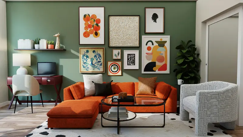
When Beige Misbehaves
"One day it looked creamy, the next it was pink." That sentence is practically a rite of passage for anyone who has ever painted a room beige. You stand in the paint aisle searching for the most neutral color imaginable, bring it home with optimism, and suddenly discover that "neutral" has surprising opinions about your furniture, your floors and the time of day.The culprit is not that you chose the wrong beige so much as that you were never really choosing beige at all. You were choosing an undertone. Every off white, greige and beige hides a subtle bias within the color: a whisper of pink, green, yellow or gray that only fully reveals itself once it lands in a real space and meets real light. In a studio, that undertone is measured in careful, technical terms. In a living room, it shows up as "Why does my wall suddenly look kind of green?"
Understanding undertones is less about memorizing color theory and more about learning how your eye compares one color to another. Our brains judge color relationally. Beige only feels warm when there is a cooler reference nearby, and a calm greige can look unexpectedly purple when you place it next to something more yellow. The color itself has not changed. Its neighbors have.
Once you grasp that color is highly social, the apparent misbehavior of beige begins to make sense. A soft, balanced paint chip in the store is not a promise; it is a starting point. What you are really choosing is how it will interact with the existing cast of characters in your home: your wood tones, your fabrics, the direction of your windows and even the greenery outside. When beige disappoints, it is usually because we asked it to be a blank canvas in a room that was already full of strong cues.
A more helpful way to think about so called neutrals is that they are quiet colors with clear opinions. Some lean toward "pink beige," soft and rosy, flattering to skin and linen. Others lean "green beige," cooler and earthier, comfortable alongside stone, plants and gray upholstery. When you can name the undertone, you can start to pair it deliberately instead of being surprised by it.
Light, Context and the Secret Life of Neutrals
If undertones are the personality, light is the script that tells them what role to play. A pink beige in a north facing room, where light is cooler and bluer, will often appear more muted and gray because the cool daylight pulls some of the warmth out of the color. The same paint in a sunny south facing room may glow rosy and inviting by midday, then deepen into a stronger beige as the sun lowers.This shift throughout the day is normal and unavoidable. Paint manufacturers test their colors under standardized lighting, but homes live in a constantly changing mix of daylight, lamplight and reflection. A green lawn right outside a large window can bounce just enough color into a room that your beige picks up a green cast by afternoon. At night, warm bulbs can make that same wall feel almost golden.
Because your eye reads color by comparison, anything large in your space acts as a reference point. Warm oak floors can pull a subtle pink out of a beige that seemed neutral on its own. Cool gray tile may suddenly make a warm beige look peach. Here the wall has not misbehaved. It has simply admitted what it always was: a beige with a warm bias sitting next to something cooler.
The way to work with this, rather than against it, is to test in context and in scale. A small sample pressed against a white paper card is better than looking at a chip against the fluorescent chaos of the store. An even larger painted board or poster held near your trim, floor and sofa is better still. You want to see your chosen beige not just in abstract, but in the same company it will keep once the room is finished.
Color pros often use a trick called "isolation" to judge undertones. They place a color sample on a plain, bright white background so the eye is not distracted by surrounding hues. Instantly the bias becomes more obvious: that supposedly neutral wall color suddenly reveals itself as slightly pink compared to the cool white; another looks delicately green. You can do the same at home with a sheet of white printer paper and painter's tape. The goal is not perfection but clarity. Once you can say "this beige leans pink" or "this one is a green beige," you can decide which better belongs with your particular mix of light, flooring and furnishings.
Designing with Undertones Instead of Fighting Them
When you recognize that you are always choosing undertones, you can use them to support how you want a room to feel. If your space is full of blue grays, cool marble and northern light, a green beige often plays more peacefully than a pink beige because it shares some of that coolness while still offering warmth. In a room with warm walnut, brass and terracotta textiles, a pink beige will feel harmonious and soft, echoing those rosy notes rather than competing with them.The key is to decide whether you want contrast or continuity. Continuity means choosing undertones that repeat or gently rhyme with what is already in the room. A beige that carries the same yellow warmth as the oak floor will make the space feel cohesive, as if walls and floor belong to the same story. Contrast, by comparison, means letting the undertone provide a quiet counterpoint. A slightly green beige against warm leather can make the leather look richer and more intentional, as long as the overall balance does not tip into cold.
The most forgiving route, especially in smaller or light challenged rooms, is to keep the family of undertones consistent. If your trim is a warm white with a creamy base, choose a beige that carries similar warmth, so there is no sharp line where one ends and the other begins. The result is a gentle gradient instead of a series of unrelated panels. Your eye can rest, which is often what people mean when they say a room feels serene.
It also helps to remember that fabrics and textures soften the way you read color. A pink beige wall that feels too sweet when the room is empty may balance perfectly once a natural linen sofa, sisal rug and greenery are in place. Those elements distribute warmth and add muted, organic tones that keep the undertone from dominating. Similarly, a green beige that seems a touch too cool on its own may feel grounded once wooden furniture and woven baskets enter the scene.
In the end, the question is not whether a beige is objectively right or wrong but whether its undertone quietly repeats the feelings you want in the room. Do you want the space to feel sunlit even on gloomy days? A gently pink or yellow beige helps. Do you crave a calmer, more understated backdrop for books, art and plants? A green beige or soft greige might serve you better.
When you notice your walls shifting from pink to green and back again, you are not failing at neutrals. You are witnessing how color really behaves in the wild. Once you start to see those undertones on purpose, you can choose them with confidence, and beige stops being a gamble and becomes one of your most precise tools for shaping how home feels.