The Psychology of Water at Home
Designers like to say that "water is a color before it is a substance." In rooms, it arrives first as a mood: spacious, reflective, and slightly out of time. Before you buy a single blue cushion, it helps to understand why water imagery has such a particular effect on the nervous system.Water is movement and containment at once. Your eye recognizes a horizon line or the suggestion of a shoreline and immediately reads distance. This visual depth widens even a narrow hallway or a studio apartment. The mind responds by unclenching; there is somewhere for the gaze to go besides the nearest wall or screen.
Then comes rhythm. A pattern that hints at waves or ripples functions like a visual metronome. It is neither chaotic nor rigidly symmetrical. Instead, it lands in what psychologists call "soft fascination"—just engaging enough to hold your attention lightly, without demanding it. That gentle pull is part of why people linger longer in front of the ocean than in front of an abstract painting of equal size.
Even color temperature matters. Cool blues, grays, and muted greens lower our sense of heat and noise; warmer, mineral blues and sea-glass tones feel social and luminous. The goal in water-inspired decor is not to turn your home into a theme restaurant, but to smuggle these psychological cues—depth, rhythm, coolness—into ordinary rooms in a way that feels almost subconscious.
There is also a moral comfort in water motifs. Oceans, fog, and still coves remind us of systems far larger than our own schedules. When your lamp base quietly echoes the curve of a wave, or your rug carries the pale gradient of a shoreline, you are living inside a small, reassuring reminder that your inbox is not the whole planet.
The most successful water-inflected interiors borrow qualities rather than literal scenes. Instead of a wall mural of dolphins, think about what it means to translate "tide," "mist," or "still surface" into proportion, finish, and light. Once you start to notice what actually relaxes you at the beach or near a lake, you can begin to reproduce the underlying geometry at home.
Ocean and Waves: Depth, Motion, and Quiet Power
"Ocean" is less a color palette than a spectrum of vertical depth. At the shoreline, water is pale and nearly translucent; a few yards out, it darkens to teal; at the horizon, it can collapse into something close to black. To evoke that depth indoors, you need a gradient, even if it is subtle.On walls, consider reserving darker tones for the lower half of the room. A deep blue sofa or rug grounds the space like a sea floor, while paler upholstery and curtains act as the top layers of water and sky. The eye understands the hierarchy instantly: there is weight below and air above. This vertical sequence is quietly stabilizing, particularly in small or heavily furnished rooms that might otherwise feel top-heavy.
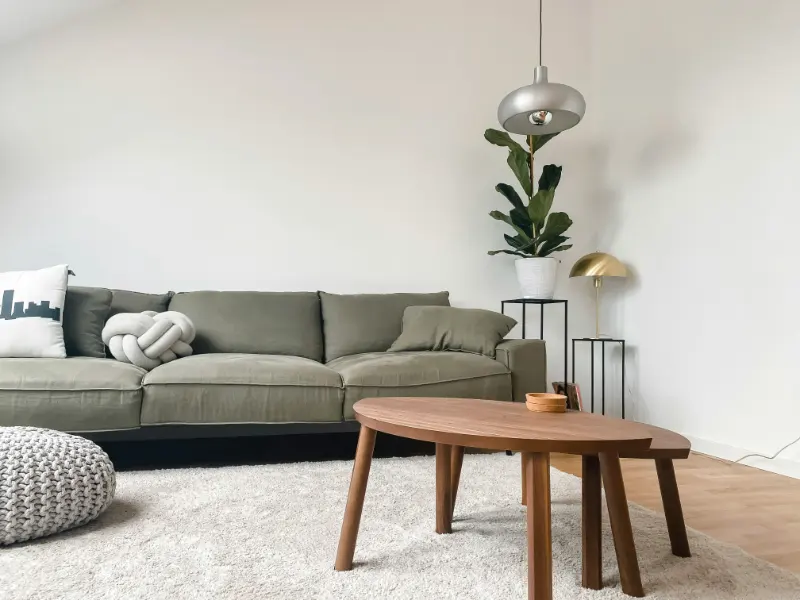
Wave forms, meanwhile, are an opportunity to replace hard, rectilinear lines with intervals of curve. A coffee table with a gently irregular edge, a headboard with a soft arc, or a mirror whose frame undulates rather than snaps into right angles will suggest wave action without a single literal crest. The principle is that nothing in nature is perfectly straight; slight asymmetry reads as more alive, and therefore more forgiving.
Pattern can be a more overt reference, but it benefits from restraint. A single rug with a large, sweeping wave motif can energize a living room, provided the surrounding textiles stay largely solid or textured rather than equally busy. In bedrooms, small-scale, rippling patterns on shams or throws capture the idea of water lapping at the edge of consciousness, but they work best against calm, matte walls. You are aiming for the sense of quiet power water has at night, when you hear it before you see it.
Material choice reinforces this atmosphere. Matte ceramics that look almost like wave-smoothed stones, linen that crumples the way wet sand buckles underfoot, and wood with a clear, visible grain all echo the coastline more effectively than glossy synthetics. The ocean is never overpolished; your finishes should not be either. A single high-gloss accent, like a lacquer tray or a glass-topped table, can stand in for a sunlit patch of water, but when everything shines, nothing feels aqueous.
Light is the final collaborator. Ocean light is directional and reflective, not evenly fluorescent. At home, favor pools of illumination with shadows in between; table lamps and low sconces that cast soft, sideways light reproduce that near-the-water quality far better than a blazing overhead fixture. If there is a particular surface you love—a blue painting, a dark-green wall—let light skim across it at an angle to create a faint, wave-like shimmer.
Fog and Stillness: Designing for Quiet Perception
If ocean decor is about depth and motion, fog and still water are about restraint and the discipline of editing. A foggy morning compresses the world into a limited palette and muffled soundscape. In interiors, this translates into reducing contrast so that edges soften and the room feels, in a gentle way, slightly out of focus.One way to cultivate this is through "low-chroma" color: muted grays, blue-grays, stone, bone, and greenish neutrals that seem to borrow their hues from sky rather than pigment. Painting walls, trim, and even doors in nearly the same color minimizing stark boundaries, much as fog erases the clear line between water and air. Furniture in similar tones does not vanish; it simply stops shouting for attention, allowing shape and texture to matter more than color drama.
Texture is where fog-inspired rooms truly live. Think in terms of layers of similar softness rather than competing surfaces. Sheer curtains that let light leak through, a wool rug that diffuses sound, a plaster or limewash wall that catches shadows in its irregularities: all of these act like different densities of vapor. The room becomes less about objects and more about the air between them.
Still water adds a reflective counterpart. A low, calm interior can carry a single, deliberate mirror placed to catch slow-moving scenes: leaves outside a window, clouds crossing a patch of sky, a hallway where people drift rather than rush. The idea is reflection as meditation, not spectacle. Avoid mirror mosaics and fragmented reflections; like a pond, the surface should be continuous enough that your eye can rest.
Sound and storage also participate in this atmosphere of stillness. Clutter is visual noise; dense bookshelves and crowded surfaces behave like choppy water, scattering your attention. It is not that you must live minimally, but that you should be selective about what remains in sight. A clear tabletop with one sea-stone, a ceramic bowl, or a single glass vessel of water says, "this is where your gaze may land." Closed storage absorbs the rest, as the depths of a lake absorb fallen leaves.
Finally, leave room for literal stillness. In a home where every corner performs—desk, dining, workout, entertainment—consider designating a small, water-influenced zone that has no task beyond existing. A chair turned toward a window, a low stool by a plant, a cushion on the floor near a shallow bowl of water or a vase of branches. No screens, no chargers. You are making a little interior cove, a place where time eddies.
Water-inspired decor, at its best, is not a style but a way of pacing perception. Ocean and waves introduce depth and movement; fog and stillness soften the frame and slow your pulse. Between them, you can tune your rooms like a tide: sometimes high with energy, sometimes low and hushed, always with the suggestion that beyond the walls, a larger rhythm continues.